Brand guidelines
The Lynkarr look, voice and name, and how to use them
For anyone putting Lynkarr beside their own work: press, partners, resellers, affiliates and directories. Take the logo files from this page, keep to the few rules about space, size and colour, and you do not need to ask us first.
Part 1 · Voice and tone
Welcome to Lynkarr
Lynkarr makes the things that connect something printed, sent or handed over to something online: QR codes, short links, digital business cards, landing pages, forms and email signatures. Each one is measured, so the person who made it can see what it did.
It is one account rather than several subscriptions, on the web and in an Android app, with a free plan to start on.
What we promise
A code, once printed, has to keep working. Where it points can change; the code on the paper does not. Everything else we make is held to the same idea: what you send out stays yours to steer and to measure after it has left.
What we are for
To let a small team do what used to need four tools and a designer: make the code, the link, the card and the page, put them where people are, and know what came of it.
How we sound
Plain. We say what a thing does in the words a customer would use, and we say what it does not do in the same breath. A sentence that needs a second reading is rewritten.
Exact. A number is a real number or it is labelled an example. An open in an email is called approximate, because it is. We do not say “the only”, “the best” or “revolutionary”.
Warm, without performing it. Short sentences, sentence-case headings, no exclamation marks, no jargon where an ordinary word exists.
- WriteChange where a code points after it is printed.
- Not
Unlock next-generation dynamic QR experiences! - WriteOpens are approximate; taps are exact.
- Not
Industry-leading 100% accurate email tracking.
What we hold to
People print what we make. A change on our side must never break something already on a wall, a box or a business card.
We show what was measured and say how. Where a number is uncertain we say so on the page, beside the number.
Prices, limits and what each plan leaves out are written where a customer will read them before paying, not after.
Part 2 · Visual mark
Identity at a glance
| Logo |  |
|---|---|
| Colour | Violet to cyan, on midnight or on white. |
| Type | Aa Aa The reader's own system typeface on screen; Inter everywhere else. |
Trademark
Lynkarr™ and the Lynkarr logo are trademarks of Lynkarr LLC.
You may use the name and the logo to refer to Lynkarr, its products and its services, as long as the reference is truthful, fair and not misleading, and keeps to these guidelines. The guidelines may change; the version and date are at the top of the page.
Do not use the name or the logo in a way that suggests we make, endorse or sponsor your product or service; in the name of your own product, company, domain or social handle; or altered in any of the ways shown under What not to do. If we ask you to stop using them, please do.
The logo
The logo is the mark and the name together, side by side. This is the form to use first, wherever there is room for it.
The name in the logo is lowercase and is drawn, not typed: never set it again in a typeface. The .com is part of the logo and stays cyan.
Use it on white, on midnight, or on a quiet, even background that is close to one of the two.
Logo variations
Four forms, in the order to reach for them.


The mark
The mark stands alone where the full logo will not fit or the name is already said: an app icon, a profile picture, a favicon, the corner of a video. Use the gradient mark first. The one-colour marks are for a single ink, an engraving, or a background the gradient would fight with.




Clear space
Keep an empty margin around the logo, free of type, pictures and the edge of the page. The margin is x, where x is half the height of the mark.
Because x is measured from the logo itself, the rule holds at any size: a logo 72 pixels tall keeps 36 pixels clear on every side. The mark used alone keeps the same margin, half its own height.
More space is always welcome. Less is not.
Smallest sizes
Below these the name stops being readable and the mark's inner shape closes up. If the logo will not fit at its smallest size, use the mark alone.
| Form | On screen | In print | Shown at its smallest |
|---|---|---|---|
| Logo (mark and name) | 120 px wide | 30 mm wide | |
| The mark alone | 24 px tall | 8 mm tall | |
| Favicon and browser tab | 16 px, the mark only | Not used | The one place the mark may go below 24 px. |
Always scale the logo in proportion: lock the width to the height. Use the SVG of the mark wherever a vector is accepted, and a PNG at twice the displayed size where it is not.
What not to do
Use the files as they are. Each of these has been done to somebody's logo, and each makes it somebody else's.
Tagline
One line says what we are and the promise behind it. Use it whole, as one sentence, with the full stop. Set it in white, midnight or cyan, never in the gradient.
It can sit under the logo, as it does on our channel banners, or stand alone as a headline. It is not part of the logo and is never locked to it at a fixed distance.
QR codes, short links and digital business cards
that keep working after they are printed.
Typeface
On screen, Lynkarr is set in the reader's own system typeface. It loads nothing, it is the face each person reads all day, and it is the right weight on their screen. Away from the screen, where a typeface has to be named (print, slides, video, an advert), use Inter, which is free and open.
The stack, as the website declares it
font-family: ui-sans-serif, system-ui, -apple-system, "Segoe UI", Inter, Roboto, "Helvetica Neue", Arial, sans-serif;
That is San Francisco on Apple devices, Segoe UI on Windows and Roboto on Android. For figures in tables and for code, a monospaced face: IBM Plex Mono, or the system's own.
Colour
Two grounds, midnight and white, carry everything. The gradient is the brand's colour and is used sparingly: in the mark, and in one accent at a time. CMYK values are worked out by arithmetic for a first proof; a printer should match to the HEX.
Core
- HEX
- #0A0F1C
- RGB
- 10, 15, 28
- CMYK
- 64, 46, 0, 89
The dark background, and the logo's lettering on a light one.
- HEX
- #0B1120
- RGB
- 11, 17, 32
- CMYK
- 66, 47, 0, 87
Text on a light background.
- HEX
- #FFFFFF
- RGB
- 255, 255, 255
- CMYK
- 0, 0, 0, 0
The light background, and the logo's lettering on a dark one.
- HEX
- #F7F9FC
- RGB
- 247, 249, 252
- CMYK
- 2, 1, 0, 1
Panels and cards on a light background.
- HEX
- #5A6785
- RGB
- 90, 103, 133
- CMYK
- 32, 23, 0, 48
Secondary text, captions and notes.
The gradient's five stops
- HEX
- #7F02FD
- RGB
- 127, 2, 253
- CMYK
- 50, 99, 0, 1
Where the gradient starts, top left.
- HEX
- #6633FD
- RGB
- 102, 51, 253
- CMYK
- 60, 80, 0, 1
A quarter of the way.
- HEX
- #3C78FD
- RGB
- 60, 120, 253
- CMYK
- 76, 53, 0, 1
The middle of the mark.
- HEX
- #2798FD
- RGB
- 39, 152, 253
- CMYK
- 85, 40, 0, 1
Three quarters.
- HEX
- #00CFFD
- RGB
- 0, 207, 253
- CMYK
- 100, 18, 0, 1
Where it ends, bottom right. Also the .com in the logo.
Interface
Used inside the product and on the website, for things that are pressed or that report a state. Not brand colours: do not use them to colour the logo.
- HEX
- #2456E6
- RGB
- 36, 86, 230
- CMYK
- 84, 63, 0, 10
Buttons and links on a light background.
- HEX
- #5B87FF
- RGB
- 91, 135, 255
- CMYK
- 64, 47, 0, 0
Buttons and links on a dark background.
- HEX
- #1F6BFF
- RGB
- 31, 107, 255
- CMYK
- 88, 58, 0, 0
Headline accents and eyebrows on marketing pages.
- HEX
- #0F8A5F
- RGB
- 15, 138, 95
- CMYK
- 89, 0, 31, 46
Done, saved, verified.
- HEX
- #B45309
- RGB
- 180, 83, 9
- CMYK
- 0, 54, 95, 29
Needs attention.
- HEX
- #C0392B
- RGB
- 192, 57, 43
- CMYK
- 0, 70, 78, 25
Errors and things that cannot be undone.
The gradient
Violet to cyan through three blues, running from the top left to the bottom right at 120 degrees. It is the mark's own colour, so it is used with care: one gradient to a layout, never as a background for text, and never behind the gradient mark itself (use the white mark there).
background: linear-gradient(120deg, #7F02FD 0%, #6633FD 25%, #3C78FD 50%, #2798FD 75%, #00CFFD 100%);
Icons
Icons are drawn as outlines on a 24-unit grid: a stroke of about 1.8, rounded ends and joins, no fill, one colour. They are small pictures of the thing itself (a card, a code, a link), not decoration, and each sits beside the word it stands for.
Part 3 · Assets
App icon and profile picture
The app icon is the gradient mark on midnight. The profile picture is the same mark on a deeper violet-to-blue ground, drawn to be cropped to a circle, and is what our YouTube, Reddit and Facebook pages carry.
Do not make your own version of either. Do not add a border, a badge or a seasonal hat.

Product pictures
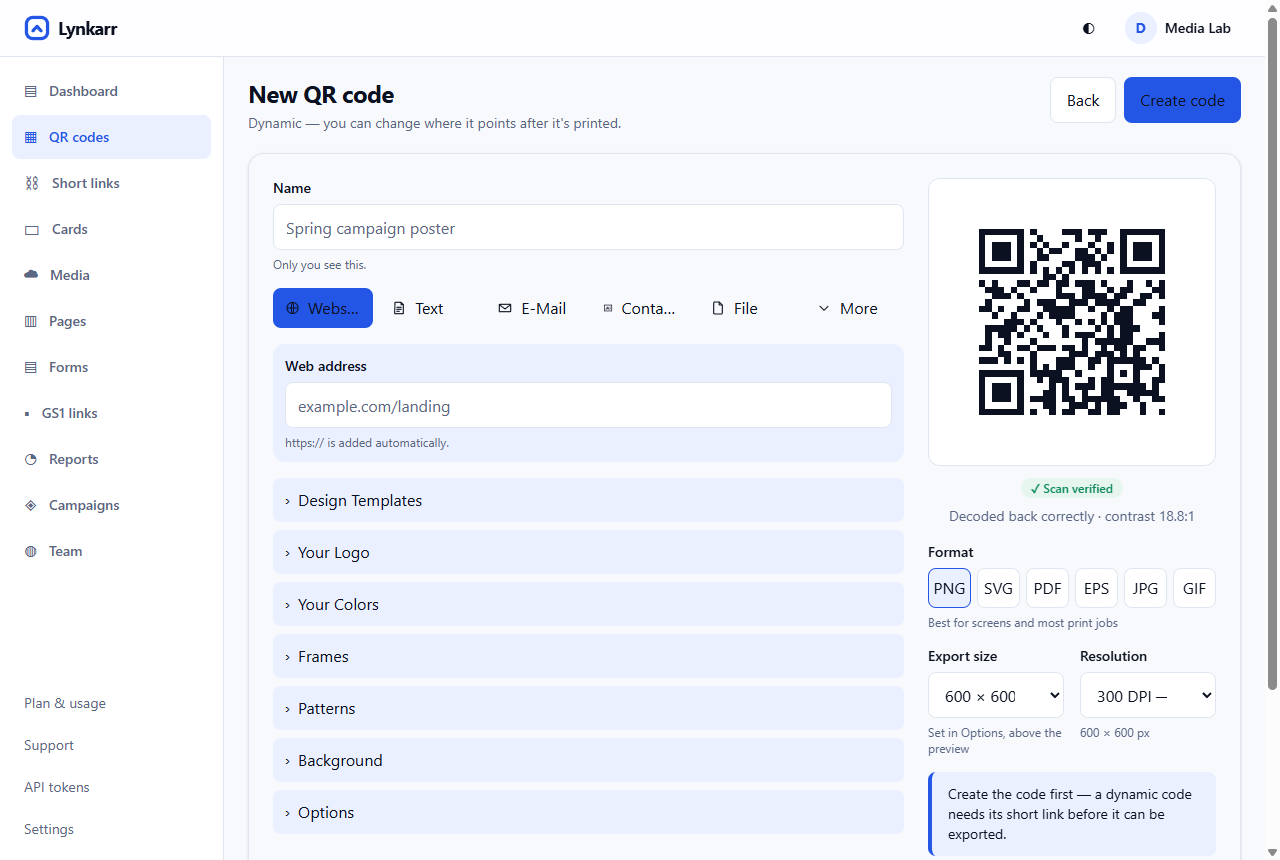
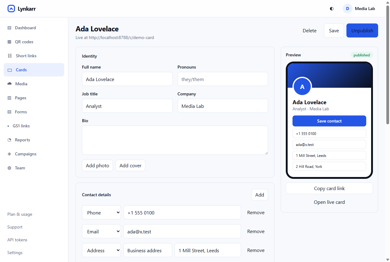
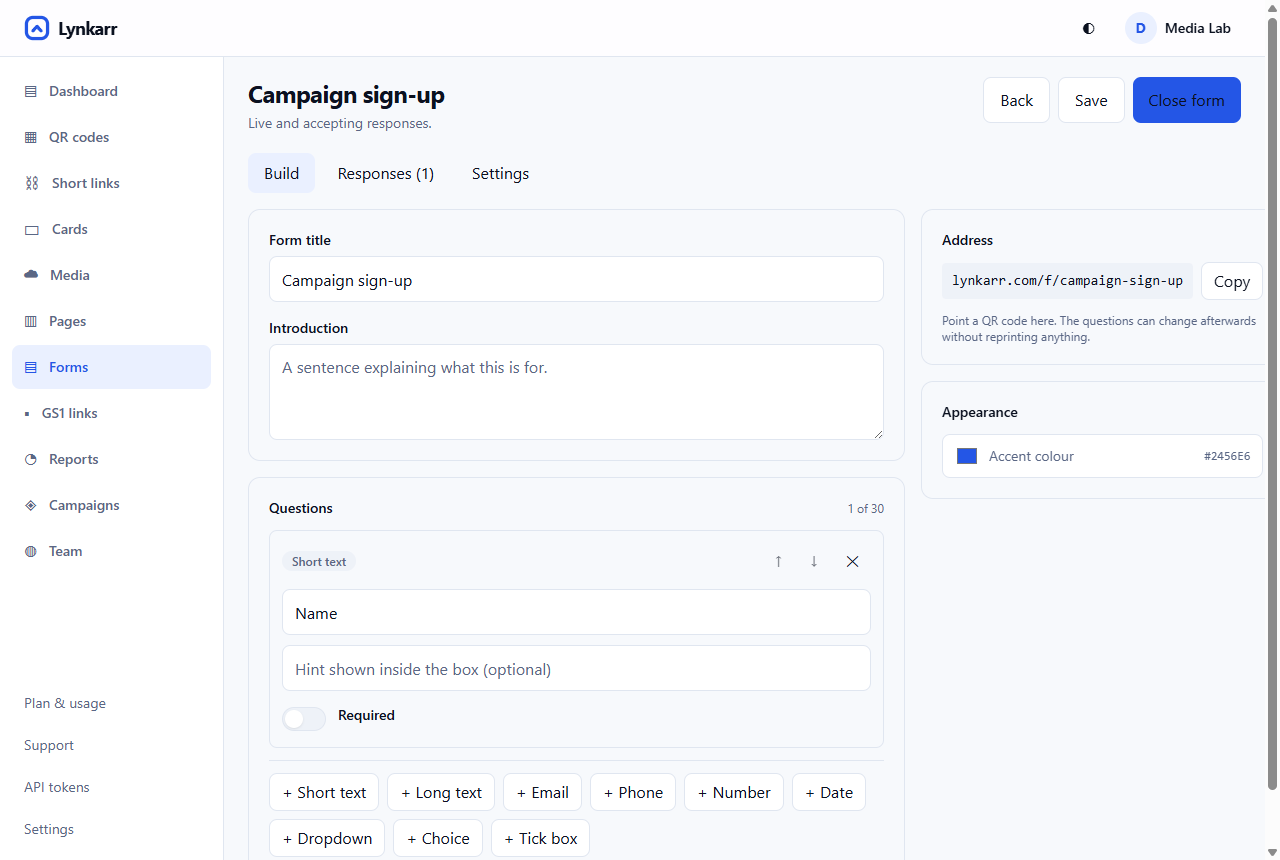
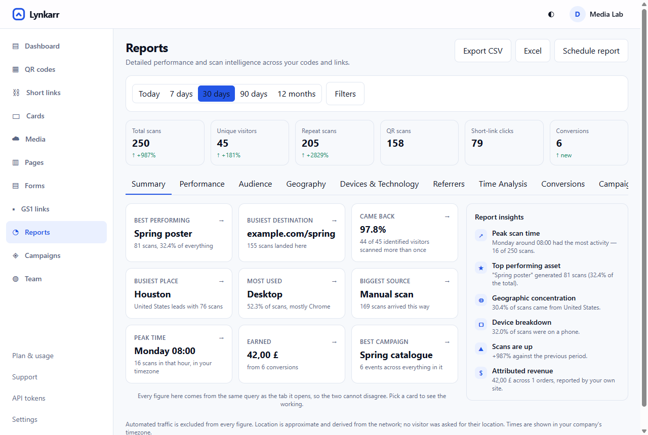
Pictures of the product are of the product: real screens, with made-up people and example figures that are labelled as examples. You may use these four in an article or a listing about Lynkarr. Do not edit what a screen shows, and do not put a real person's name or a real company's figures into one.
QR codes in our own work
A QR code in anything we publish is a real one that goes somewhere. It is dark on light with its quiet margin kept, at least 2 cm across in print, and tested from the finished piece before it goes out. The mark may sit in the middle of a code only where the code still passes that test.
Downloads
Everything in one file, or each by itself. The files are free to use under the rules on this page.
Download all logo files (.zip)
- Logo for light backgrounds
Mark and name, midnight lettering. PNG, transparent, 1372 by 364.lockup-dark.png - Logo for dark backgrounds
Mark and name, white lettering. PNG, transparent, 1372 by 364.lockup.png - The mark
The gradient mark as a vector, for any size.mark.svg - The mark, PNG
Transparent, 330 by 364.mark.png - The mark in one colour, midnight
For light backgrounds where the gradient cannot be printed.mark-midnight.png - The mark in one colour, white
For dark backgrounds where the gradient cannot be printed.mark-white.png - The name for light backgrounds
Lettering only. PNG, transparent.wordmark-dark.png - The name for dark backgrounds
Lettering only. PNG, transparent.wordmark.png - App icon
512 by 512.app-icon.png - Profile picture
512 by 512, made to be cropped to a circle.avatar.png
Part 4 · Using the name
Writing the name
In a sentence the name is Lynkarr: a capital L and nothing else capital. Only the logo is lowercase. It is a name, not a verb, and it takes no “the”.
- WriteLynkarr
- Not
lynkarr, LYNKARR, LynKarr, Lynkar, Linkarr, Lynkarr.com (as the company's name) - Writea QR code, a short link, a digital business card
- Not
a QR Code, a Shortlink, a Digital Business Card™ - WriteMade with Lynkarr. Works with Lynkarr.
- Not
A Lynkarr company. Lynkarr certified. Official Lynkarr partner (unless we have agreed it in writing).
The first time the name appears in something formal, it may carry the trademark sign: Lynkarr™. After that, leave the sign off. The company is Lynkarr LLC, which takes no sign.
Beside another logo
When Lynkarr appears with a partner's logo, set the two side by side at the same visual height, with a thin vertical rule between them and each logo's own clear space kept on both sides of the rule. Neither logo is redrawn, recoloured or joined to the other.
Resellers who sell Lynkarr under their own name use their own brand on what their customers see; these guidelines then apply only where the name Lynkarr itself is shown.
Company facts
| Name | Lynkarr (the product); Lynkarr LLC (the company) |
|---|---|
| Founded | 2026 |
| Based in | Texas, United States |
| What it is | QR codes, short links, digital business cards, landing pages, forms and email signatures, with analytics for each, in one account. |
| Where it runs | On the web at lynkarr.com, and as an Android app on Google Play. |
| In one sentence | Lynkarr makes QR codes, short links and digital business cards that keep working after they are printed. |
Who to ask
Not sure whether a use is all right?
Send us what you have in mind, with a picture if there is one, and we will say yes or suggest a change: support@lynkarr.com.